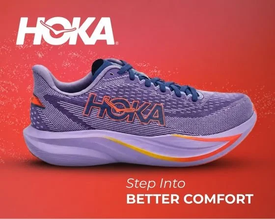
SoftMoc Hero Banner Design Study
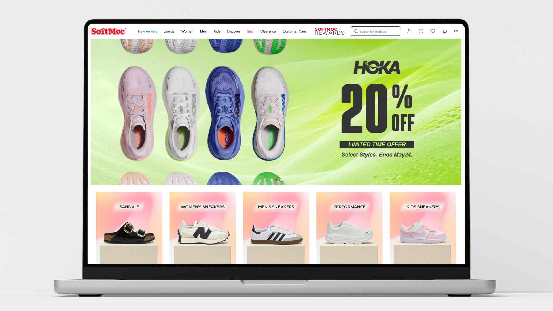
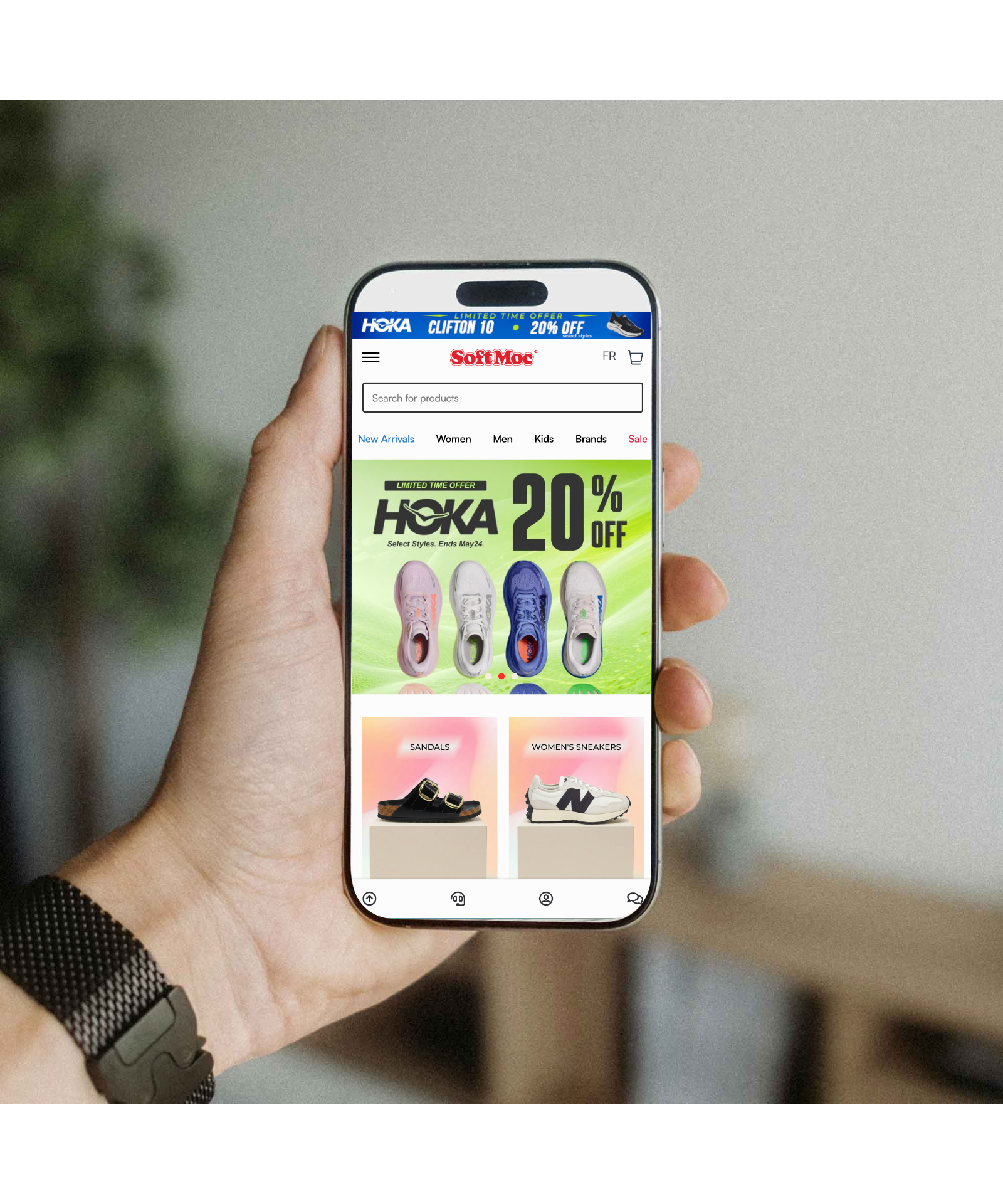
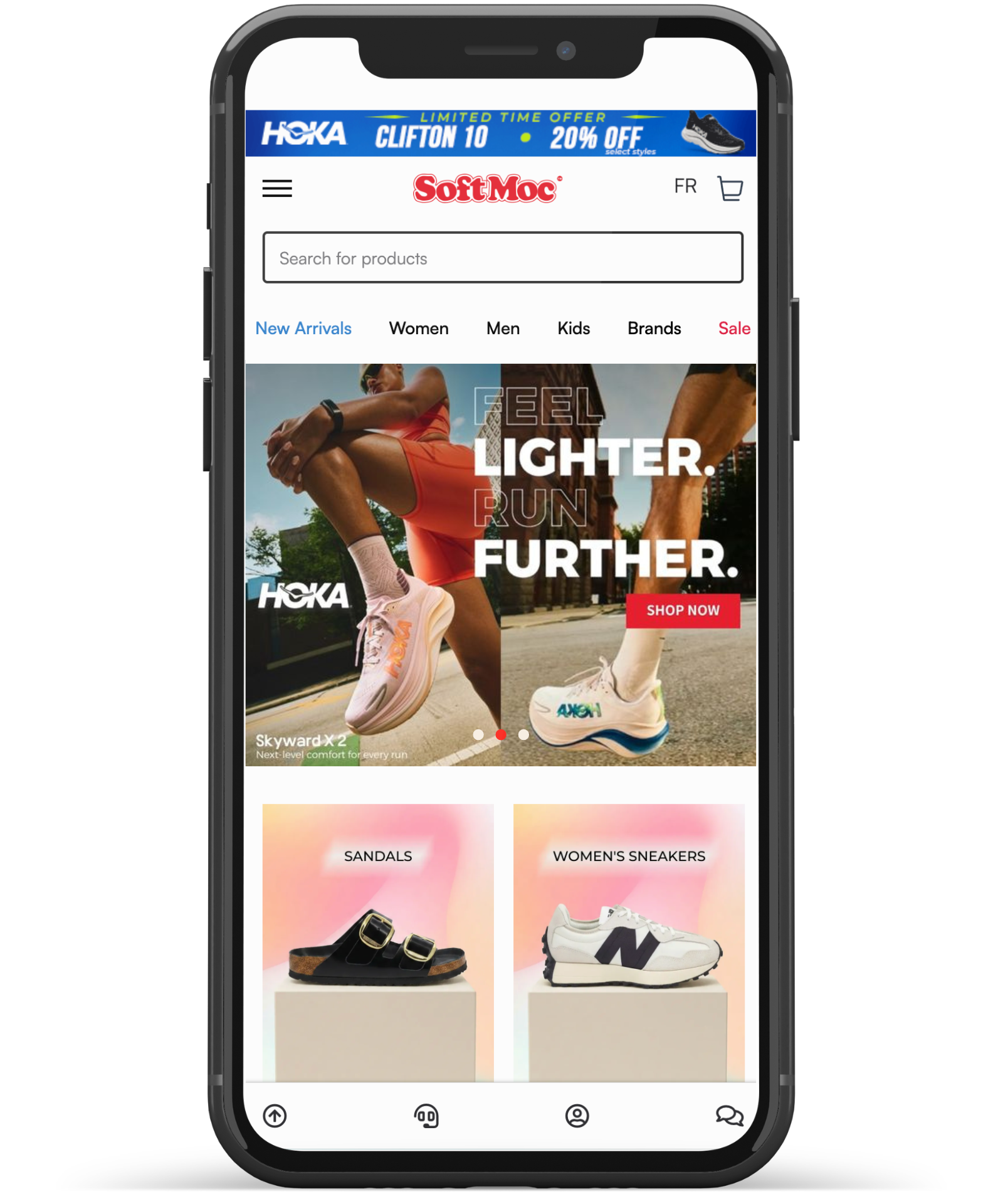
Desktop mockup
Project Overview
For this design test, I developed 4 different homepage hero banner concepts for SoftMoc across both desktop and mobile layouts. Each concept was created with a different marketing objective in mind, including seasonal promotions, product launches, and brand storytelling for HOKA. Why HOKA? Keep scrolling :)
Before starting the design process, I studied SoftMoc’s current website banners, typography system, layout structure, spacing, and promotional approach. The goal was to ensure each banner felt aligned with the existing SoftMoc brand identity while still introducing a fresh and elevated visual direction suitable for a modern footwear e-commerce experience.
↘︎↘︎↘︎ Discover the Concept Behind the Hero Banner
-
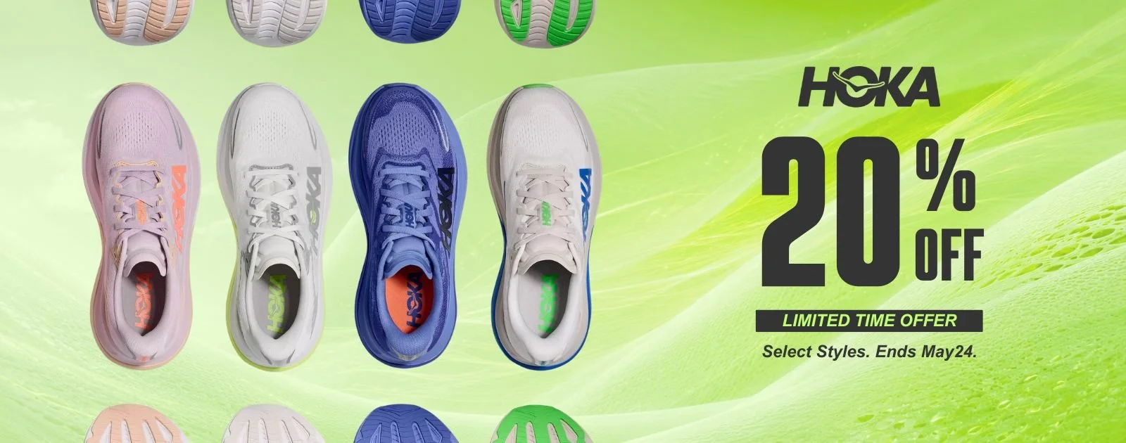
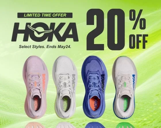
Objective
To create a clean promotional banner focused on urgency and product visibility for a limited-time sale campaign ending May 24.Design Direction
The selected HOKA shoe model is positioned as the primary visual element using a straight-on front-facing composition. This angle immediately captures attention and highlights the structure and identity of the shoe.To support the visual without overwhelming it, I introduced subtle fabric texture details in the background. These textures reference the shoe materials while adding depth and dimension to the composition.
Key Design Decisions
Front-facing shoe placement creates a strong retail-focused visual hierarchy
Minimal background distractions keep attention on the product
Soft texture layering adds sophistication without competing with the footwear
Clear sale messaging reinforces urgency and improves promotional clarity
-
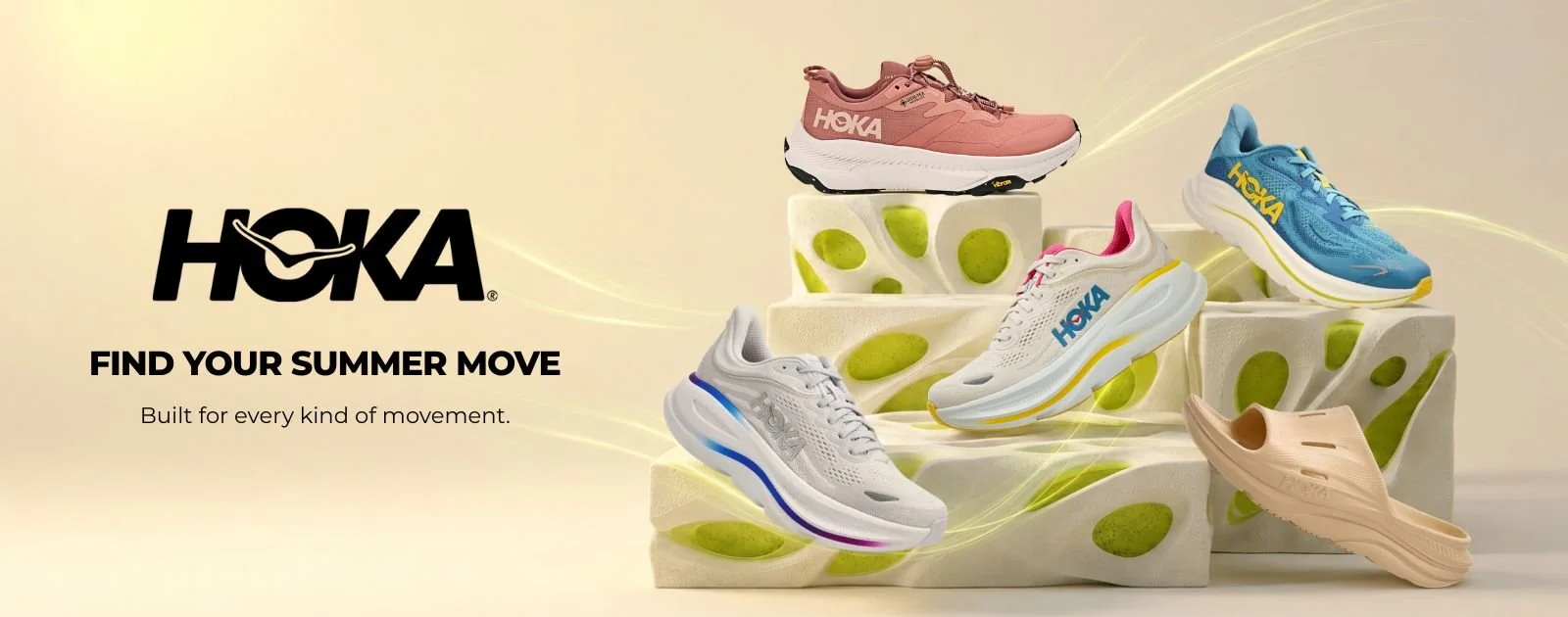
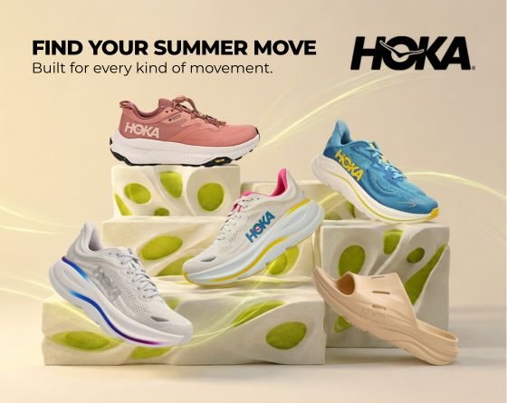
Objective
To create a visually energetic summer campaign introducing multiple HOKA categories and encouraging customers to explore movement-focused lifestyles during the summer season.Creative Concept
Different HOKA shoe models are displayed on futuristic platform structures with neon green and light yellow lighting accents. The environment creates a high-tech and fresh summer atmosphere while visually separating the different product categories.“Find Your Summer Move”
The headline was designed to emotionally connect with customers by encouraging activity, movement, and seasonal refreshment.“Built for every kind of movement”
And the supporting sub-headline communicates HOKA’s versatility across: Running, Trail running, Recovery footwear, Sandals etc…Visual Strategy
Neon green and yellow tones create freshness and seasonal energy
Platform structures add depth and premium presentation
Lighting direction enhances the futuristic aesthetic
Multiple shoe models communicate category diversity
-
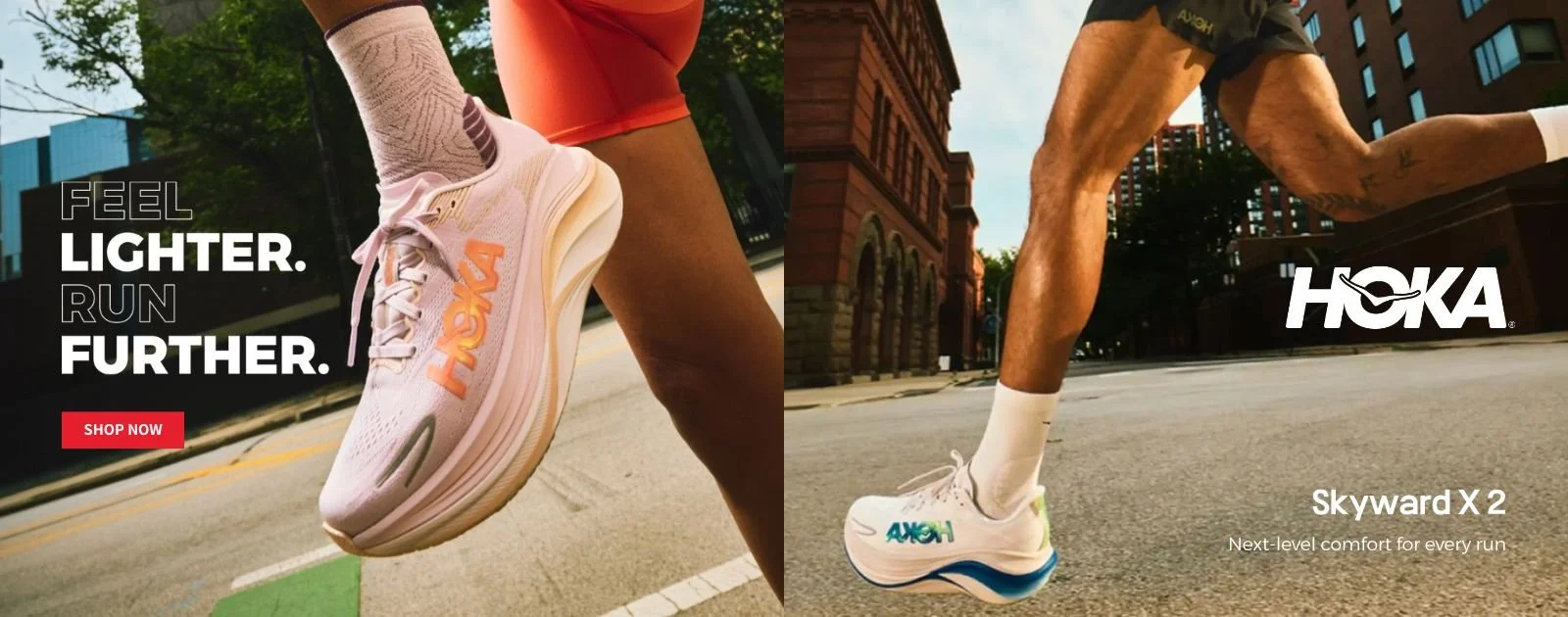
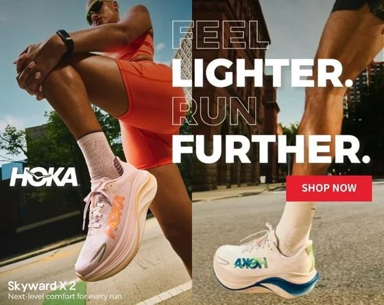
Objective
To introduce the newest HOKA Skyward X 2 model with a premium and product-focused visual approach.Design Direction
This banner uses a split-screen composition featuring two official HOKA campaign visuals:Left side: close-up street portrait focusing on the shoe’s side profile and technical detailing
Right side: lower-angle styling shot featuring a different colorway
The layout emphasizes the footwear itself without adding unnecessary graphic elements or visual distractions.
“SHOW NOW“ CTA button has added in this banner for purposeKey Design Decisions
Split-screen composition creates balance and storytelling
Different viewpoints showcase versatility and design detail
Minimal layout increases focus on the product launch
Typography placement remains subtle to preserve visual sophistication. *I intentionally reduced decorative elements so the product photography could lead the entire experience:)
-
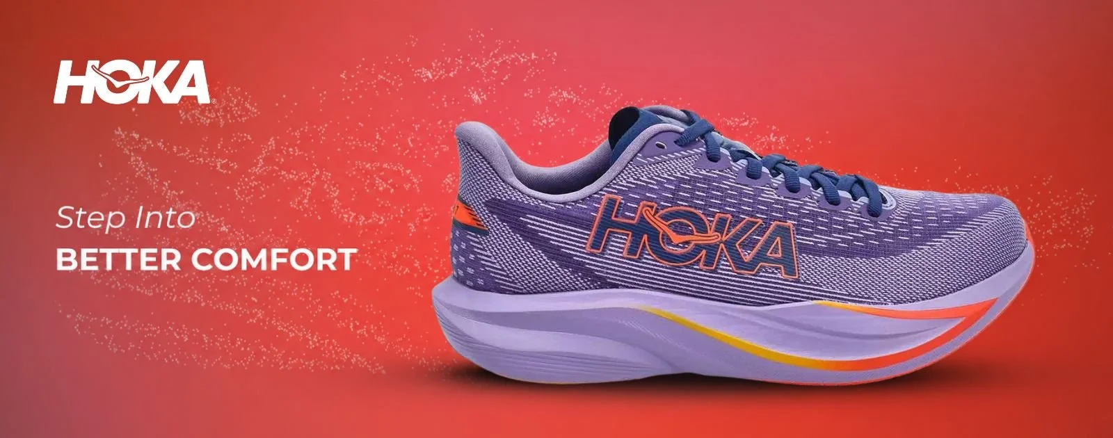
Objective
To create a bold, highly visual banner focused on comfort and product impact.Creative Direction
A single shoe model dominates over half of the banner using a large-scale side profile composition. The enlarged placement creates immediate visual impact and draws attention directly to the silhouette and cushioning design.Behind the shoe, I introduced flowing particle-inspired elements to create movement and fluidity throughout the composition.
The overall color palette was developed based on the shoe itself:
Purple as the dominant base tone
Red gradient lighting accents for energy and depth
This creates a harmonious color system that feels immersive and visually cohesive.
To maintain consistency with the brand identity, I used:Montserrat Regular
Montserrat Bold
Visual Strategy
Oversized shoe composition maximizes attention
Particle motion graphics add flow and energy
Minimal headline keeps the design feel native to SoftMoc ecosystem while maintaining readability
Harmonized gradients strengthen product integration
Mobile mockup
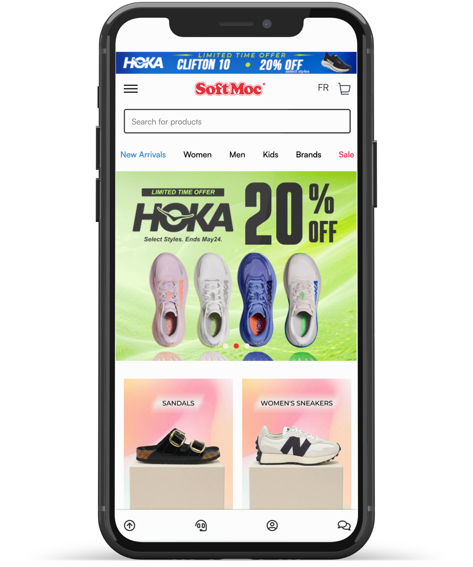
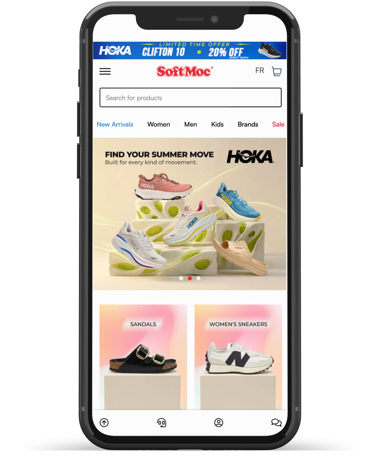
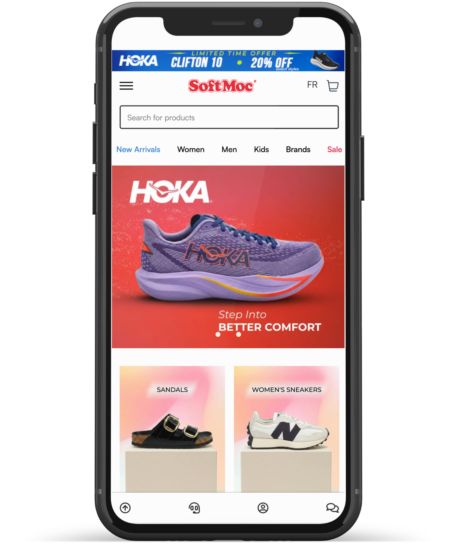
Mobile Version
Final Design Approach & Conclusion
Throughout this project, my design approach focused on balancing strong brand consistency with commercial effectiveness, while maintaining a modern athletic aesthetic and clean e-commerce presentation. Rather than creating four visually identical banners, I intentionally explored four distinct campaign directions to showcase versatility in promotional storytelling, seasonal marketing, product-focused visuals, and lifestyle-driven branding. Each concept was designed with a clear purpose — not only to create visually engaging content, but also to reflect how customers interact with retail experiences and make purchase decisions online.
As a senior designer with both visual and UI/UX experience, I believe strong design goes beyond aesthetics. A successful e-commerce banner should communicate clearly, guide attention through thoughtful visual hierarchy, and create an emotional connection that supports both engagement and conversion. Every design decision in this project was made with customer behaviour, shopping psychology, and brand positioning in mind.
Why I Chose HOKA?
I chose HOKA for this project for a personal reason as well. Running has always been an important part of my lifestyle — I run twice a week and regularly go on long trail runs every weekend. Because of my passion for running, HOKA felt like a natural brand choice for me. It is a brand I genuinely connect with, both from a performance perspective and through personal experience, which allowed me to approach this project with a deeper understanding of the audience, product, and lifestyle behind the brand.
Thank you for taking the time to read through this project and explore my design thinking. I truly appreciate your time, and thank you again for reading:)